Examples of applying proven techniques to create higher converting landing pages
Your landing page serves as your first impression to your site visitors. When you give them a great first-time experience, then they will want to explore further, even go as far as making purchases, returning and giving you referrals.
Well, the term ‘good landing’ page is relative. Hence, we will get more accurate in our post and talk about a high-converting landing page, which is our definition of a great landing page.
In this post, we will talk about the importance of a landing page giving different statistics as proof while including data-driven tricks for landing page designs in 2016.
In brief, here is what you should expect to find:
- Important landing page statistics you should know in 2016
- Causes of low landing page conversion rates
- Proven ways of boosting your landing page conversion rate
Important Landing Page Statistics You Should Know In 2016
There are many statistics that touch on different areas in landing pages. For purposes of this post, however, we will look at a few relevant statistics and build our post from them.
Did you know that:
- Using correct targeting and testing methods on your landing page can increase your landing page conversion rates by 300%?
- Sadly, despite this, more than 20% of businesses have reported that they do not have an effective strategy for landing page testing.
- Of the approximately 80% of companies which carry out the test, 61% make less than five tests each month.
- On how to design your landing page:
- When creating a landing page, remember that you only have 8 seconds to impress, meaning that you need to have a compelling headline. This is because users tend to have a shorter attention span online, deciding in just 8 seconds, based on your headline, if they will proceed to read your landing page.
- Your efforts should not stop there because more than 90% of visitors who read your landing page headline will also read your CTA copy. Therefore, it has to be a great call to action button
The last important statistic to begin our post with is this:
- It is sad that only about 22% of businesses are satisfied with their conversion rates. As Bryan Eisenberg puts it, most websites do not have a traffic problem. However, every website has a conversion problem.

Could it be that their landing pages need some ironing out?
It is against this backdrop that we will discuss data-backed tips on how to improve your landing page conversion rate.
We will use proven case studies and data just to show you that other people have used these strategies and succeeded.
Proven Ways Of Boosting Your Landing Page Conversion Rate
Have An Effective Landing Page Testing Strategy
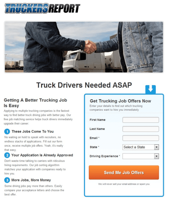
TruckersReport, a network of professional truck drivers connected by a trucking industry forum wanted to increase its conversion rate. The business decided to formulate effective testing methods, doing up to six tests.
Their original landing page, which was short and offered email opt-ins, had a 12.1% conversion rate.
This was the original page:
Source: ConversionXL
By modifying this landing page, the business hoped to increase conversion and increase overall funnel conversions.
First, the current page had to be analyzed to get a data-backed idea of how the landing page was performing.
The business conducted heuristic analysis, analyzed the performance of the original landing page and set up mouse tracking data collection using click maps, scroll maps and attention heat maps among other tools.
It is important at this point, to note that this business was not doing this blindly. This was the STRATEGY we are talking about.
As demonstrated by TruckersReport, you need to have a clear and actionable agenda when testing your landing page. In their case, there were top factors that they considered:
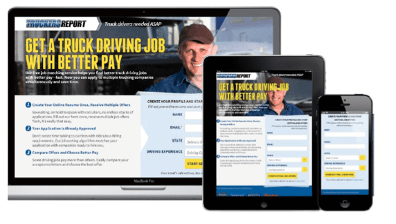
- Mobile Visits- The business saw that smartphones and tablets formed 50% of the total traffic, prompting the need to change to a mobile-responsive design.
- Headline- Their headline (Truck drivers needed ASAP) was weak, adding no significant benefit to the landing copy.
- Cheesy stock photo-They had a stock photo of people shaking hands. This, of course, did not feel personal.
- Boring design- Lack of a wow factor led to a poor first impression.
- Lack of credibility- Coupled with an indifferent photo and lack of testimonials dragged the businesses credibility to a new low. To understand the gravity of this mistake, remember that 90% of online users trust recommendations from acquaintances while 70% trust recommendations from people they do not know.
- What the drivers wanted the most- From the survey, the business sought to know what drivers needed most and used that information to redesign the landing page.
Armed with these insights, a series of tests began. Briefly, as guidance, these are the hypotheses that the business tested.
- Fewer form fields = less friction and hassle to fill out the form, resulting in more conversions. ( In this case, the long form outdid the short form by 13.56%)
- Copy that addresses most common problems truck drivers are facing, using the wording they use (taken from the customer survey) will resonate better with the audience. ( It was proven than short, precise copies worked. Including too many promises made the business seem hyped)
- Different headline variations were tested
The result:
The new and responsive design seen below led to 79.3% increase in conversion.
Source: ConversionXL
Use Effective Landing Page Testing Methods
As we saw earlier on, a significant number of businesses lack an effective strategy for landing page testing, and for those that do, 61% carry out less than five tests.
What this means:
These businesses will hardly ever know if their landing pages are working and if not, what the best practices to incorporate are.
As a result, essential practices such as carrying out an a/b test and leveraging the CONVERT model are ignored. Unfortunately for these businesses, they think that a high traffic volume website is enough. The truth is, it is not.
Let’s see how different businesses used the CONVERT model and a/b testing to improve conversions:
How To Leverage The CONVERT Model In Your Landing Pages
As much as your website may be experiencing high traffic levels, data derived from Steelhouse shows that conversion rates are usually between 1% and 3%. 97% of your visitors are not interested in what you are offering, yet.
It is against this backdrop that the CONVERT model works.
Instead of blindly waiting for visitors hoping that they will convert, the CONVERT model helps you to consciously optimize your landing page for traffic from these diverse channels.
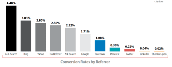
As has been showed by SmartInsights, conversion rates by channels differ. The chart below shows how different channels fare regarding conversion rates.
Source: Neil Patel
It seems that people searching for your business via AOL have the highest conversion rates while social media records the lowest conversion rates. Why is this so?
How do you lead people to your landing page? What kind of posts do you make? It is important to learn the art of creating social media adverts that convert. This way, by the time social media refers traffic to your site, people will be psychologically ready to buy.
Importantly, never send traffic from an advert or external referrers to your homepage. This page is cluttered with information and many possible actions. Send them directly to your landing page.
How To Effectively Use A/B Testing To Improve Your Landing Page
In my opinion, this is one of the easiest landing page tests you can run. All you need to do is have the original piece and create different variations, using the one that registers the most conversion.
Well, you need not be clueless on what a/b tests to run. You could test your CTA copy, images, copy text and forms among others.
Just a quick tip:
Do not be lazy and do only one test. Additionally, do not get frustrated when your variations fail to provide your desired change.
Instead of giving you a case study, let me shock and motivate you on what you could be missing if you do not a/b test.
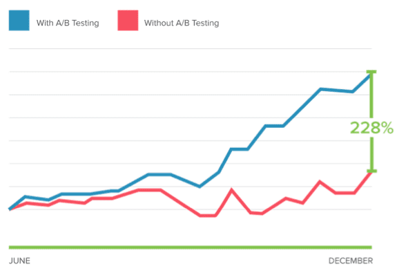
It is estimated that failure to a/b test could cost you approximately 228% increase in conversions. The graph below shows us the difference in conversions when you a/b test and when you do not.
Source: Cloudfront
How? You ask:
Well, a/b testing allows you to test different aspects of your landing page. eventually, you get a lot of data on what changes work and what doesn’t. Combined, these converting changes give you a high conversion rate.
Use Appropriate Length Of Landing Page Copy
When it comes to the question of correct length of landing page copy, there is no clear ‘one size fits all’ answer. The choice of length of your landing page copy is dependent on very many factors.
Sadly, lack of this knowledge has led to some businesses experiencing little converting landing pages.
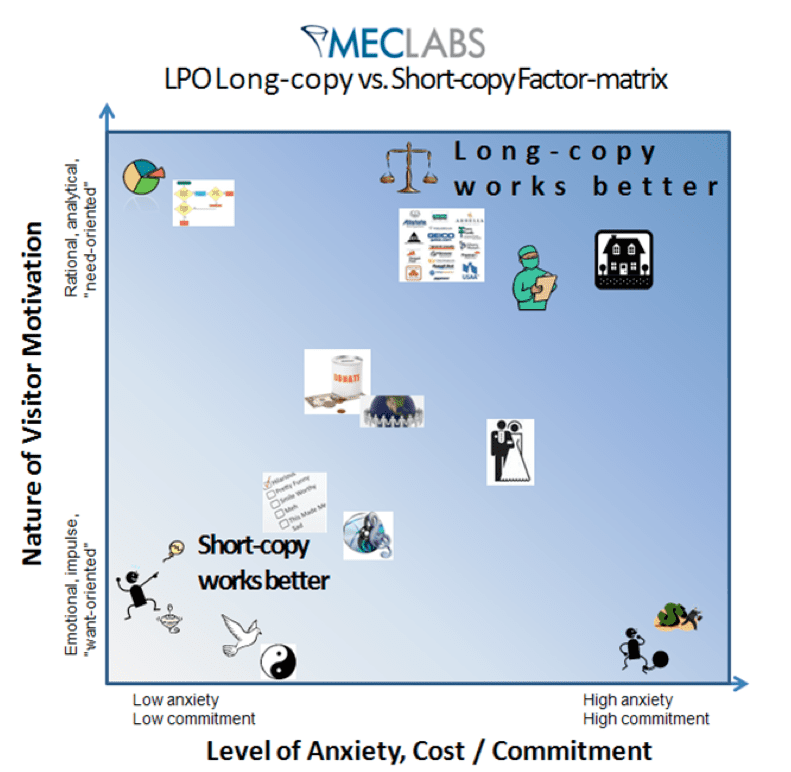
According to Bob Kemper, Director of Sciences, MECLABS, three factors affect the efficacy of body copy length on a landing page. These are:
- Nature of visitor motivation
- Initial level of anxiety about company/product
- Level of cost/commitment associated with conversion
Essentially, there are instances that you can write a short copy and others when a long copy will suffice. According to Bob, a short text is best used when there is low perceived risk, low cost and little commitment required.
In general, a short copy is best when selling concert tickets, designer shoes or even items that are offered for free. After all, who needs much convincing when they are getting something for free?
Long copy, on the other hand, is better when the risk and level of commitment are high. Additionally, when the buyer needs to make a rational, analytical and critical decision, a long form will help reduce the chances of doubt and numerous unanswered questions.
The illustration below shows the long copy vs. short copy matrix:
Source: Marketingexperiments
Let’s see how different businesses have put this into practice.
When short copies prevail:
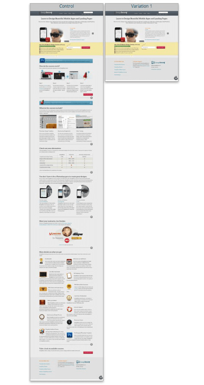
Design boost, an online design school wanted people to sign up for free courses and also view other courses offered. The short version outperformed the longer version, increasing signups by 13% and click through by 25%.
The image below shows the changes:
Source: Unbounce
When long form works:
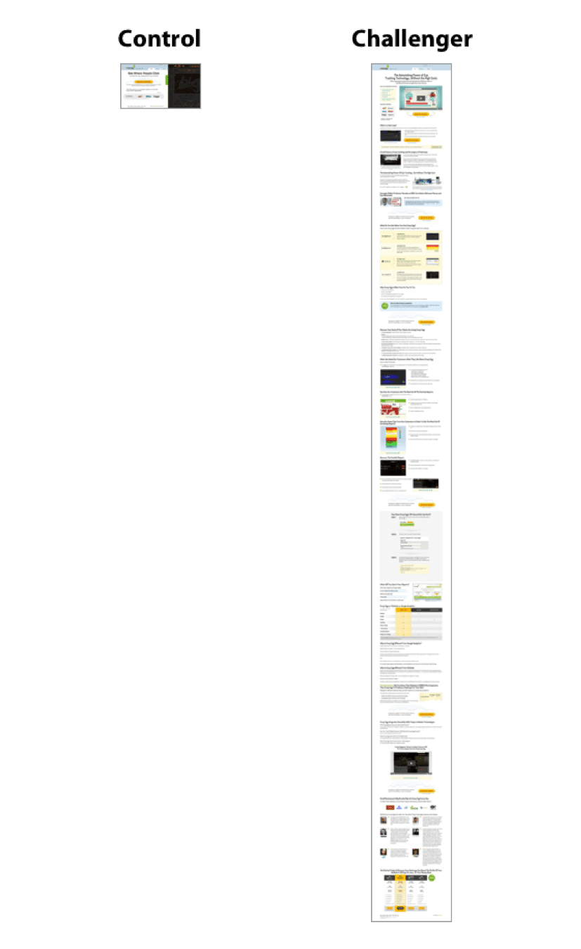
Crazy Egg changed its page from a short version to an extended version. Because its competitors offered the same services for free, the business had to explain why they were worth every dollar spent. The result, 363% increase in conversions.
The image below shows the move from a simple page to one almost 20 times longer.
Source: Unbounce
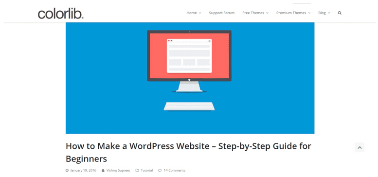
Going beyond landing pages, Colorlib published a post on how to build a website. It provides useful information for non-designers on how to choose the best platform for their business websites.
The goal of the post is to get people to use WordPress since Colorlib offer premium WordPress themes to users.
The post, spanning over 3,000 words with lots of accompanying images, may appear too lengthy for its good. However, the length works for the post because it helps guide target readers to a step by step process of an otherwise tedious task.
By offering a complete and comprehensive guide to building a site using WordPress, the post became one of Colorlib’s most popular content and helped drove more users to download their themes.
Work On Your First Impressions
Did you know that it takes 2.6 seconds for a user’s eyes to land on the part of your site that will leave an impression? Ion Interactive has shown that this time is even shorter, reporting that people form impressions in just 1/20th of a second.
Well, one company seems to have missed this point when it designed its landing page. As a clothing manufacturer, Hermes decided to get too creative when designing its landing page and ended up creating a bad first impression, as seen in the image below.
Source: Kissmetrics
From the above picture, you can see that the user experience was wanting in the sense that one had to guess on how to navigate the landing page and was at first treated to a crowded page.
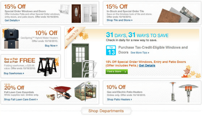
A different company, Lowes, also did not understand the value of first impressions. Instead of reading like a sales pitch, their landing page looked like a newspaper advert. Take a look:
Source: Lowes
Obviously, this is what you want to avoid on your site, making sure that you create optimized landing pages with great user experience.
Final Thoughts
There is no direct manual on how to build a high converting landing page. As we have discussed, different factors play a part in determining the success rate of your landing page. For that reason, this post serves as a manual on selected practices that have worked or not.
Therefore, for your landing page to realize its full potential, you need to frequently test it and remember that it is an iterative process. Consequently, test many aspects and run periodic tests.
If you have any comments, insights or questions, please feel free to interact with us in the comments section below.
from Smart Insights http://ift.tt/1Uxn8z9
via IFTTT


0 comments:
Post a Comment